Categories
data science

According to Facebook, I Will Have a Dad-Bod on June 28, 2021

I stepped on the scale more than 1000 times in the past decade and then used Facebook’s predictive modeling framework, Prophet, to see what I will weigh in five years if I don’t make changes. At 5’9″ I’ll officially have a Dad-Bod when I pass 200 lbs. on June 28, 2021.
Note: I couldn’t help myself from using a click bait headline. The only thing Facebook has to do with this post is I used an amazing open source prediction library they created called Prophet.

Like most people in America, I have the habit of occasionally stepping on the scale. Like most people in America, that scale has been increasing since 2008. I stepped on the scale over 1000 times in the last decade. I gathered up all this data and learned somethings about myself.

To continue building my Data Science skills, I used Python to wrangle and clean the data, visualize the data, predict likely and possible outcomes, and drew conclusions about my habits. To keep things short, I’ll jump right to conclusions *that apply to me* then go in depth below on analysis techniques, explanations, and next steps.

Conclusions

  • Weight gain is an insidious monster.
  • Weight gain happens when we’re not looking (not stepping on the scale each day).
  • Weight gain is seasonal.
  • Wednesday is a pivotal day in the week for weight loss progress.
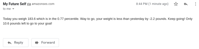
  • I control my own destiny in the future. Update, in Part 2, I create a tool, My Future Self, to defeat the Dad-Bod

Wrangling the Data

Since 2008 I used four different tools to track my weight: Hacker’s Diet Online, Weightbot (app retired, all data lost), MyFitnessPal, and TrendWeight. I was able to export, clean, and concatenate data from three of the four. Here’s the Python code I used to get a two column .csv with dates on the left and weights on the right. Update: see the GitHub repository below for the code. No judgment please, the code is not clean and could stand a good refactoring.

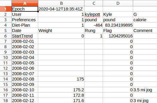
I started with the Hacker’s Diet data which was very poorly formatted (see the image below). Then I repeated the process with MyFitnessPal, which was better and finally TrendWeight which was in the best shape. TrendWeight is my current favorite tool for tracking weight as it has a tremendous amount of detail and also integrates seamlessly with my Withings wifi scale. The first part of this project was an art of renaming columns, removing null entries, removing repeating column headers, and selectively converting kg to lbs for the month or so I thought logging my weight in kgs would somehow be helpful (it wasn’t). Then I concatenated everything using an outer join to make sure I had only unique data and nothing repeating.

This is a sample of the ugly
This is an ugly csv file.

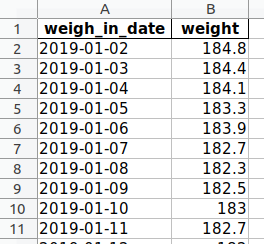
Now, we have a nice looking and easy to manage csv file with 1048 entries that we can work with for analysis and visualization.

This is a nice csv file.

Update: Originally, I included all the Python code in this post, but it got pretty lengthy. Instead, I created a new open source GitHub project if you want to download my work and use it yourself (GNU General Public License v3). Here is a direct link to a PDF of my Jupyter notebook if you’d like to follow my work step by step.

Describe the Data

After getting everything cleaned up, I started with a few basic techniques to learn more about the data.

Basic describe() function in Python gives us a good summary of the data. I binned the weights into tenths to help see the spread and give myself some targets for improvement.
I lost a lot of data from 2011 – 2015 which sucks. But, you don’t have to be a data scientist to mentally add a best fit line and see we have a problem. The weights are going up and to the right.

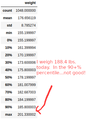
Before coming down on myself too harshly, there are two bits of qualitative information to keep in mind. This data set covers 12+ years of my life from ages 23 to 35 and ranges 46.1 pounds from a low of 155.2 to a high of 201.3.

1.) I’ll start with a bit of an anecdotal observation. I think there is something to consider that a 23 year old male, me, just finishing college and getting started in the real world may not be done growing. I would imagine if we studied populations, very few people would weigh the same at 30, 40, 50+ as they did at 23. That’s not to suggest that everyone becomes more unhealthy as they age (adding body fat), but just an acknowledgement that a low weight I achieved in 2009 of 155 lbs. at age 24 may not be possible to achieve ever again. It just may not be possible. (more on this below).

2.) I started lifting weights regularly at the end of 2011. Unfortunately, the first four years of data from when I started lifting weights is gone and unrecoverable. However, I think it is fair to say that at a very conservative rate of growth, I could add 1-2 pounds of muscle every year. That might make a new plausible low weight for me to be 164-173. That assumes adding 1-2 pounds of muscle per year and that would be a *low* weight between the 10th and 30th percentiles of all weights I’ve ever weighed in my entire adult life.

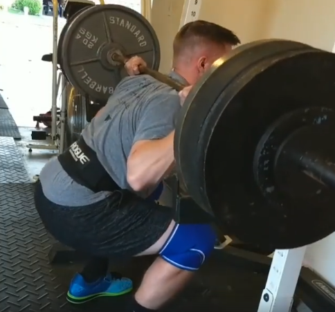
Note: when I say I started lifting weights, intensity, effort, and consistency factor in. I competed in a powerlifting meet and achieved a 1000+ lb. total (bench, squad, dead lift). I’m not an elite athlete, but just to put in context when I say I might be able to add 2 pounds of muscle per year, it’s the backing to suggest this is plausible.

Thank you actual Facebook for helping me unearth this gem.

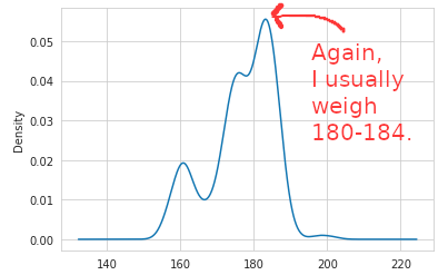
With such a wide range of possible weights, I thought it would be helpful to bin them and drop the data into a histogram. I learned that I weigh 180-184 nearly 1/3 of the time. This is good to know to help with the mental anguish of weight loss. Shouldn’t I weigh 155-160?! Actually, no I shouldn’t, because I almost never weighed that much (less than 6% of all weigh ins in 12 years). Also, it helps with setting a near term goal: get to a weight of < 180 and I’m already in the 50-60 percentile. Then get to 178 and I’m in the 40%, 175 and I’m in the 30%. We’re not talking huge numbers of pounds to lose here.

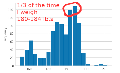
We can explain this concept in another way by showing a density chart. My greatest densities are in alignment with what we just discussed 180-184 lbs. then 179 lbs.

Another way of showing the same concept using hexbins. Where I am and then where I think I’d like to get to for the long haul.

Cycles of Weight Gain and Loss

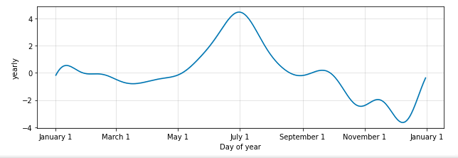
Whereas most people try to look better in their swimsuits, apparently I prefer to look thicker in my swimsuit. You know, to fill it out, I guess. After a modest downward tick after New Years, you can see a climb up that peaks around the 4th of July and then a steady weight loss through the end of summer, start of Fall, and just before the holidays. Then about a five pound weight gain through the holidays.

The Facebook Prophet library makes analyzing seasonality incredibly easy!

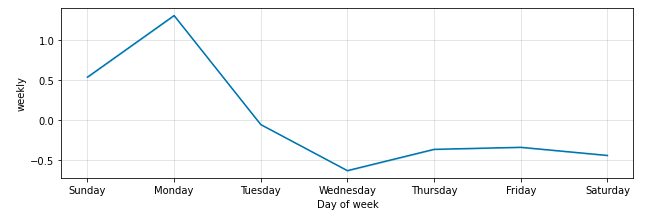
When we look at “seasonality” applied to each week, we learn more helpful insights about my habits. In order to reverse the trend here, I need to do better on Wednesdays and soften the weekend peaks. We have a bad data problem shown here. I have recorded very few weigh ins on Saturdays so that day of the week is not well represented. Presumably, because I eat a lot on Friday nights and I’m not all that interested in stepping on the scale at the start of the weekend. Another “now” habit to establish.

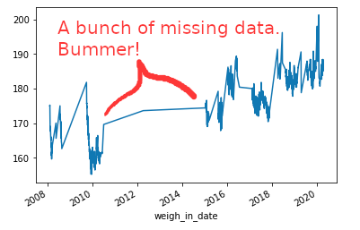
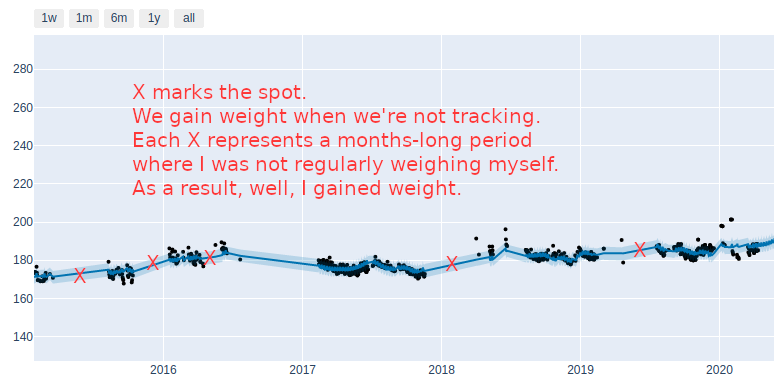
We Gain Weight When We’re Not Looking

There are a few exceptions, but unsurprisingly, long periods where I was not stepping on the scale resulted in prolonged increases in my weight.

Red Xs mark long periods where I was not weighing myself and led to weight gain. Notice each cluster of black dots shows a distinct downward trajectory. In other words, stepping on the scale each day is enough to suggest I care about my health and results. It’s not so much about having a perfect nutrition plan, but simply stepping on the scale each morning is going to help me focus on making better choices throughout the day and ultimately lead to results. Consistency matters – no surprise there.

Recipe for Success

I loved the book Atomic Habits. One of my top 10 favorite books. Author, James Clear, makes the case that to successfully establish new habits we need to break the trigger action down to the simplest, lowest level. Following that advice, here’s what I learned from this project that I will put into practice.

1.) Step on the scale every day. Even if I know I’m not going to like the results.

2.) Wednesdays are the day I will be most focused on my nutrition because it’s sets the tone for the week. No cheat days on Wednesdays.

3.) Set small goals, and keep working my way down the ladder. For me that means get to the next bin: 90th percentile is 185, 80th is 184, 70th percentile is 182, etc. until I arrive at the target range which is the 30% or 173. Update: Read Part 2 to see the system I set in place with a daily text message to remind me and give some encouragement.

Final Thoughts

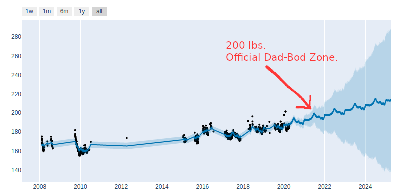
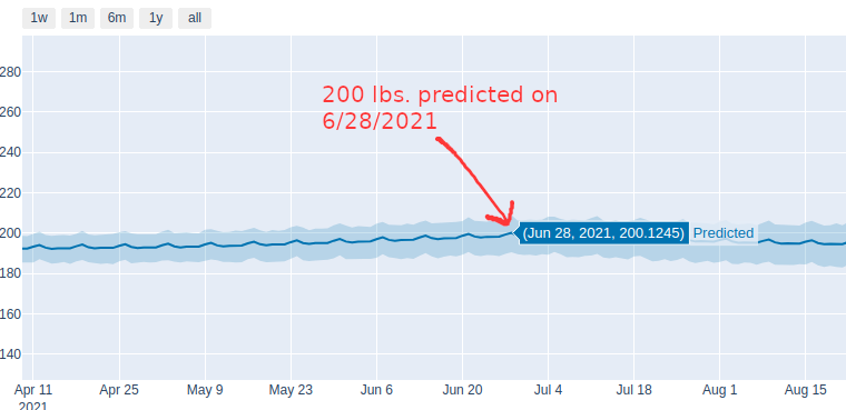
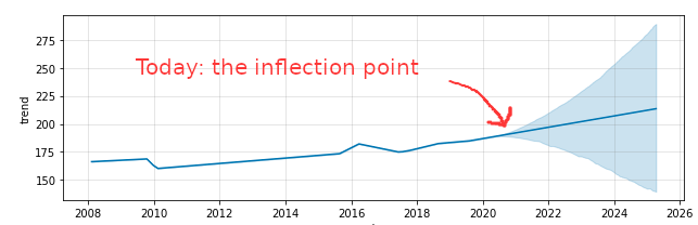
We control our own destiny – I meant for this post to be equally heavy on accountability and inspiration – we can achieve anything we set our minds to. Take a look at this last visual and look how the prediction splits toward either success and failure. There’s a quote I like that captures it:

You’re either growing or you’re decaying.

Unknown
What the next five years holds is up to me.

(Potential) Next Steps

  • I uploaded my Python code into GitHub if you’d like to geek out on this stuff yourself.
  • One critique of my analysis is that weight (alone) does not tell the whole story (lean mass vs. fat mass). This is true and one of the reasons I love using the Withings scale with TrendWeight is that I have detailed lean/fat mass readings going back to 2018. I may dive into this in more detail, but I am somewhat skeptical about the accuracy of these readings. Nevertheless, it’s something to consider exploring.
  • I am planning to tinker with the Withings API and try to create a more real-time “scorecard” to know what percentile I’m in and if I’m delaying (and ultimately defeating) the Dad-Bod date. Update: This is done. Read Part 2.
  • If there’s enough interest, I’ll consider creating a web app that you can upload your own MyFitnessPal data and then get a similar set of visuals about your own data.
  • Thank you to the Facebook engineers that created Prophet. I really enjoyed using it.

Categories
data science

Using Data Science to Pick NCAA Tournament First Round Winners

“Usually the team that scores the most points wins the game.” – John Madden

Update: If you’d like to jump right to part 2 of this series you can do so here where I turn the regression analysis into a really basic data science model.

I’m taking the first steps of an 18-24 month journey with a beginner’s mindset to establish and grow my data science skills. What better way to begin to learn new skills in March than by applying them to March Madness?!

I’ve learned the framework for any good data science problem looks something like:

  1. What’s the question we want to answer?
  2. What is the training data set we’re going to use? How are we going to wrangle the data?
  3. Exploratory data analysis including identifying relationships.
  4. Pre-processing and training data development
  5. Modeling
  6. Conclusions, documentation, presentation, clean up.

In this post, I’ll tackle the first four steps of this framework and share a few conclusions. I’ll also note right up front, while I’m beginning to dive into the technical stack that helps enable data science (Jupyter, Python, Pandas, Numpy, Pyplot, and Seaborn), the problem I tackled could be better classified as a standard “statistics” problem. It’s definitely a “small data” problem and I haven’t built the model yet – so I don’t think it’s accurate to claim this work as anything resembling “data science” yet.

I’m just starting out on this journey. There’s probably so much wrong with my thinking here. I would love those with more experience to offer criticism and point out the flaws in my thinking and application. I tried not to over-complicate the technology, so I used Excel. The data set could be loaded into a structured database or something even more complex – but why? Let’s keep things as simple as possible. For the modeling portion I may load it into MySQL or Postgres.

What’s the problem we want to tackle? How do we pick round 1 tournament winners? Why do we only care about round 1? Simple. I’ll be in Las Vegas actually betting on the first round games. So let’s find an asymmetric advantage, put it to use, and benefit from it! That’s the goal any way. Here are a few of my starting hypotheses:

  • In 2018 the NCAA retired the strength of schedule measure, known as RPI, and replaced it with NET rankings. The basis of NET rankings is bucketing wins into quads. The NET rankings take into account, game results, strength of schedule, game location, scoring margin, offensive and defensive efficiency, and quality of wins and losses. I won’t explain all of this here, but my hypothesis is: does playing in and winning quad 1 games correlate with winning a first round tournament game? This hypothesis was born out of frustration seeing a team like Dayton ranked in the top 5 nationally, but having played in only three quad one games and my beloved Fighting Illini playing in 15+ quad 1s and being ranked #23. I’m just not convinced that teams that play in very weak conferences should be in the national conversation, sorry Dayton. P.S. Dayton’s strength of schedule ranks 94th nationally. Dayton’s non-conference strength of schedule ranks 185th nationally. Sorry, that’s not a #3 ranked team in my book.
  • I dove into the quad 1s and it got me thinking, what factors correlate strongest to winning in the first round? What’s the strongest correlation I can find? Offensive rebounds? Turnovers? Defense? Three point shooting? Getting to the line and actually hitting free throws? I ran these all down!

Okay, let’s get to it!

What’s the training data we’re going to use? How do we wrangle the data? We’re going to grab and collate data from a variety of sources – let’s start by grabbing the 2019 NCAA first round tournament results. Let’s also grab the Vegas Money Line odds for these games. I like to bet the Money Line – just picking winners and losers – I don’t mess with the spread. We’ll also grab the quad 1 results for each tournament team last year. We’re going to grab the KenPom.com data and with a premium subscription from KenPom, we’re also going to grab the “Four Factors.” I won’t exhaustively describe all these factors, but suffice it to say, that I hopped right on the shoulder’s of giants and grabbed the absolute cutting edge of basketball stats that I could find:

  • Adjusted Efficiency Margin is the difference between a team’s offensive and defensive efficiency. It represents the number of points the team would be expected to outscore the average D-I team over 100 possessions.
  • Effective field goal percentage is like regular field goal percentage except that it gives 50% more credit for made three-pointers.
  • Turnover percentage is a pace-independent measure of ball security.
  • Offensive rebounding percentage is a measure of the possible rebounds that are gathered by the offense.
  • Free throw rate captures a team’s ability to get to the free throw line.
  • Quad 1 Wins wins over “good” teams – top 30 wins at home, top 50 wins at a neutral site and top 75 road wins. We test for wins, attempts, wins + attempts, winning percentage, win margin, and win + attempts margin.

There are breakouts for offensive efficiency, defensive efficiency and the “Four Factors” also apply to offense and defense. Additionally, we include national rankings for each category as well as quad 1 data. All in, we’re looking at 37 different factors to determine correlation.

Let’s write some code!

I used Pandas to outer join data from three different spreadsheets matching the data according to team name. This was very, very awesome and easier than collating in Excel directly and much faster than doing it by hand. The code below reads in a spreadsheet matches the team name and spits out a new spreadsheet with all the data matched up. Sweet!

Edit: I should have done either a left join or an inner join. The outer join included everything that matched and everything that did not match. An inner join or left join would have just included the data about the rows that matched. Not a big deal, but a learning point that would have resulted in data wrangling and cleanup time for me.

import pandas as pd df = pd.read_excel("kenpom19.xlsx","summary19_pt") df2 = pd.read_excel("offense19.xlsx","offense19") outer_join_df = df.merge(df2, how="outer", on="TeamName") outer_join_df.to_excel("Outerjoin.xlsx",index=False) df3 = pd.read_excel("Outerjoin.xlsx","Sheet1") df4 = pd.read_excel("defense19.xlsx", "defense19") outer_join_df2 = df3.merge(df4, how="outer", on="TeamName") outer_join_df2.to_excel("Outerjoin2.xlsx",index=False)
Code language: Python (python)

Exploratory data analysis and descriptive statistics

I love how easy Pandas makes it to analyze and describe the training data! Early in this project I was pulling everything into arrays and using NumPy to find the coefficient correlation manually of each variable! Then I switched to Pandas and basically did all the manual work instantly. Here’s the old way where I was correlating every variable against the round 1 wins for each region.

import numpy as np q1winper = [.8,0,.285,.285,.55,.375,.583,.333,.4545,.25,.5,1,.5,.285,.692,0] r1win = [1,0,0,1,0,1,0,1,1,0,1,0,0,1,1,0] np.corrcoef(q1winper,r1win)
Code language: Python (python)

Then I did a little bit better by using Pandas to read in entire columns of data instead of manually creating the arrays.

import pandas as pd import numpy as py df = pd.read_excel("ncaa.xlsx","Sheet1") q1winsplusattempts = df['2019_quad1_wins_plus_quad1_attempts'] r1win = df['2019_round1_win'] py.corrcoef(r1win,q1winsplusattempts)
Code language: Python (python)

Finally hit it out of the park by using Pandas to import and native functions to correlate and sort according to strongest correlation!

df5 = pd.read_excel("Outerjoin2.xlsx", "Sheet1") df6 = df5.corr() #sort by absolute value to establish ranking by highest correlation df6.abs().sort_values(by=['2019_round1_win'], ascending=False)
Code language: Python (python)

Now we have the basis on which we can build our model! For the next steps, we’ll use our Money Line odds to apply the variables that have the highest correlation with round one wins to build a model to maximize our chance of guessing the round 1 winners correctly in this year’s tournament. We’ll also calculate our expected winnings (or losings). But before I get to the conclusions, here are a few critiques.

Critiques

With the NCAA switching to NET rankings, this becomes an incredibly small training set. We essentially have only one year of tournament wins with which we build our training set. This will get better over time, but what we’re essentially saying is X variable has a strong correlation with winning last year’s first round game.

Correlation can be used for predictive purposes, but you know correlation doesn’t equal causation thing. For example, the tournament seeding awarded on Selection Sunday has the second strongest correlation of the 37 variables we looked at. Just getting a higher seed doesn’t cause you to win tournament games. I’m also very skeptical of that variable because I know how manual the selection and seeding processes are. I also think the 1 vs. 16, 2 vs. 15 matchups so rarely result in an upset that they overly sway the seeding variable, so we’re going to avoid using seeding in our final model.

Second critique here, and I’m not sure what to call this, but I may be overloading the correlation of the wins + attempts variable and some of the other variables. As an example, what I mean is adjEM takes into account adjOE so we wouldn’t necessarily want to include both in the final model. I’m going to try to keep the model as simple as possible and not “over index” it with repetitive variables.

Third, this a shallow data pool. Sure, I could very easily pull in data for each year going back to 2002, however, I’m not sure I see a meaningful enough return on the effort that would take. Are we really going to unearth a new variable in 17 years worth of games that we wouldn’t see in one year, about 35 games? I suppose it’s possible but I’m not willing to invest the time.

Lastly, remember, Vegas always wins. Any advantage we’re going to find here is going to be modest. Vegas adjusts the money line constantly — all the way until the game starts — that way they are hedging against any loss. Games that are so lopsided (1 vs. 16 matchups) usually don’t even include a money line because there’s no way for Vegas to be profitable on it. The house makes, sets, and then resets the odds in their favor! We analyzed 38 variables through occasional effort in the evenings. In Vegas you’re going up against full-time, highly experienced statisticians that include 2000+ variables and they run thousands of models to simulate each game. At the end of the day, what we’re doing is just a little more informed guessing. The house always wins. We’re left with Lady Luck. At least we feel better losing our money because we tried hard. Good try, good effort.

Conclusions

There does appear to be something to the old adage, “being battle tested and battle proven.” Playing in more quad 1 games (and winning them) does give you a better chance at winning a first round tournament game.

Adjusted Efficiency Margin looks to be the best single predictor of tournament success. No surprise here as this measure is so dang comprehensive, factoring in: pace, turnovers, shooting effectiveness, rebounding, free throws, fouling, and just about everything you can think of.

Defensive may win championships, but according to our analysis, offensive is a better predictor of first round tournament success. If in doubt, go with the team that gets more buckets!

Categories
Uncategorized

Conwell Quotes – WordPress Plugin With a Backdoor

Conwell Quotes is a malicious WordPress plugin that hides a reverse shell in a backdoor behind legitimate plugin functionality. This is used for offensive security purposes.

Here is a direct download of version 1.0 of the plugin that you can add to WordPress.

You can find the open source code on GitHub.

Modeled after the Hello Dolly plugin which comes packaged on all new WordPress installation, Conwell Quotes displays a random quote on each page of the WordPress admin portal based on Conwell’s Acres of Diamonds (which is one of my favorite books). It also uploads an error.php backdoor that can be used to open a reverse TCP shell. The reverse shell code was mostly written by Pen Test Monkey. The print lines have been either commented out, suppressed, or slightly modified to avoid detection.

Offensive Security Use

You’ll want to change the port and IP address of error.php to match your attack system and then upload the plugin or use in combination with the spear phishing sample below.

Upload the plugin to WordPress, use netcat to open a listener on your attack machine, and then open /wp-content/plugins/conwell/error.php in a browser. The screen will most likely clock, but will not display an error message that tips off the reverse shell.

Note

Some hosts, like Bluehost, have their WordPress accounts on non-dedicated IPs which means they have nearly all ports blocked. You may not be able to use the malicious shell in error.php. However, the legitimate functionality in Conwell Quotes will still work and the user will not receive any error message.

When uploading the plugin, WordPress does not have any malware detection and so the plugin will install and activate as usual. To get access to the reverse shell, the plugin does not need to be activated, it simply needs to be installed. Yet another good reason to delete out any unused WordPress plugins.

Used with Spear Phishing

Subject: Great book.

Hello [name],

I know how much you love writing and great quotes. Check out Russell Conwell’s Acres of Diamonds on Wikipedia.I think you’d love this book. In WordPress you can install the Conwell Quotes plugin which will rotate great Conwell quotes on your WordPress dashboard–which is awesome!

Enjoy!

[name]

Next Steps

Now that I have more experience writing plugins with WordPress, I think I can write a plugin that can be used to detect the presence of an unexpected reverse shell – a malware defender so to speak.

Do this one thing.

Make sure you delete, and don’t just deactivate, unused WordPress plugins.  This is a perfect example of the malicious code residing in the plugin even if it is deactivated.